 EN
EN  ES
ES 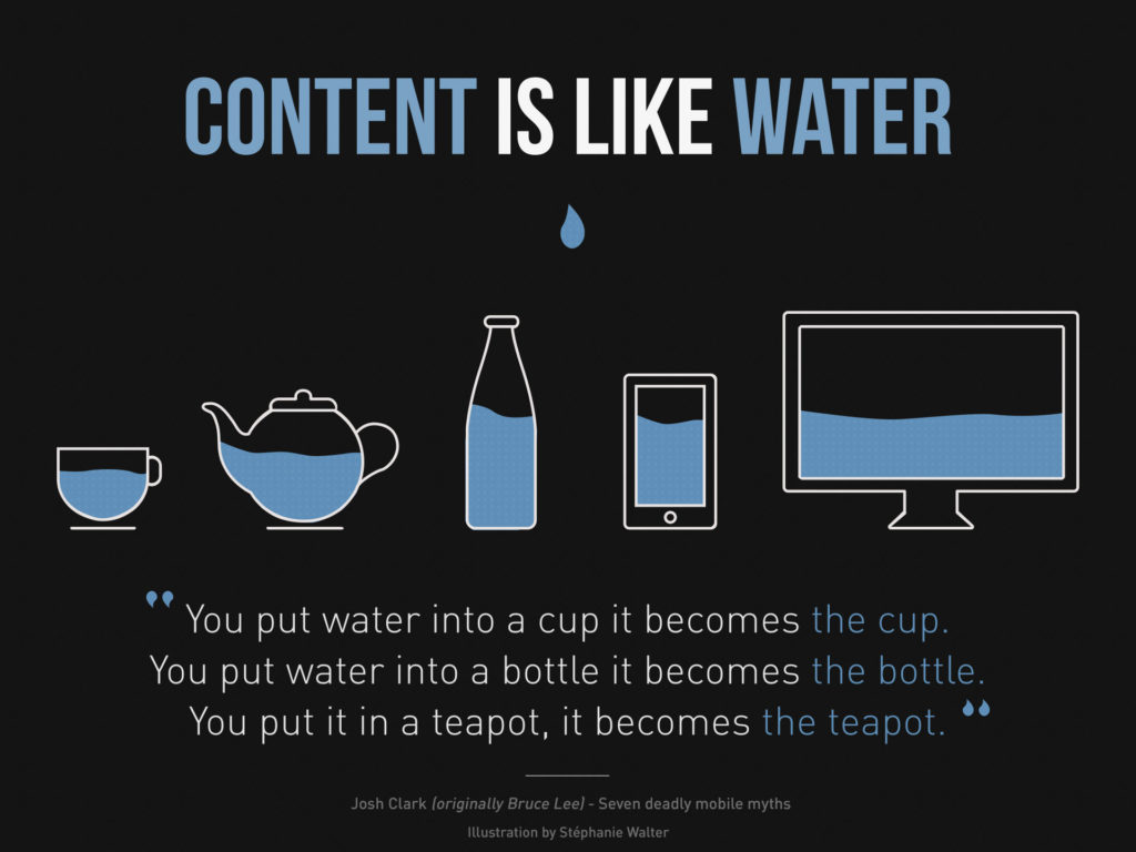
What Is Responsive Design?
If you’re interested in web design or development, you’ve probably heard the term “responsive design” (sometimes called “responsive web design”) more times than you can count. But what does it mean exactly, and how do you do “responsive design?” It’s not a coding language, like HTML5 or CSS3, which you can learn by studying syntax. Rather, responsive web design is more of a design paradigm; a way of thinking about the process of building a website.
Have you ever noticed a website that looks beautiful on your laptop, but horrible on your smartphone, or vice versa? That’s what happens when web designers ignore the concept of responsive design. On the other hand, have you ever noticed a website that looks great on your laptop, and then morphs seamlessly into a more mobile-friendly version of itself when you view it on your smartphone? Websites like cnn.com, huffingtonpost.com, and mashable.com are all great examples of responsive web design. They’re designed to look great on all of your devices.
Responsive web design is all about creating websites that are responsive to a wide variety of screen sizes. As you might imagine, this is easier said than done… but once you get the hang of it, it’s actually a lot of fun. Before you read on, please note that some basic knowledge of HTML and CSS is required in order to understand the following tutorial.
How To: Responsive Design (Tutorial)
Part 1. Responsive elements (sections, images, and text that resize with the browser window)
Let’s say you want to put an image on your website, like the one below. The width of the image is 1920 pixels, and you want it to fit nicely into the text on your blog post. The problem is, the width of the column of text on your blog post may vary depending on the size of the screen that you’re looking at. If you define the width of this image as 1920 pixels, then it won’t adapt to the size of the screen, and it won’t adapt to the width of the column of text in which it’s contained. It will, most likely, stick out like a sore thumb, and break the flow of the blog post. How does this fixed-width image look on your screen?
The image above was put onto this webpage with the following HTML code:
<img style=”width: 1920px; height: 1440px;” src=”https://fvi.edu/wp-content/uploads/2016/06/Content-is-like-water-1980.jpg” alt=”Responsive Design” />
Note how the width is defined as 1920 pixels, regardless of the size of any of the other elements on the page, or the size of the screen in general.
The solution to this problem is to define the width of the image in percent rather than pixels. Percentages are fluid, whereas fixed sizes are not. So if I define the width of my image as 100% of the width of the column of text in which it is contained, then it doesn’t matter what size screen you have, or how wide the column of text is; the image will always match the width of the column of text. How does this fluid-width image look on your screen?
This image was put onto this webpage with the following HTML code:
<img style=”width: 100%;” src=”https://fvi.edu/wp-content/uploads/2016/06/Content-is-like-water-1980.jpg” alt=”Responsive Design” />
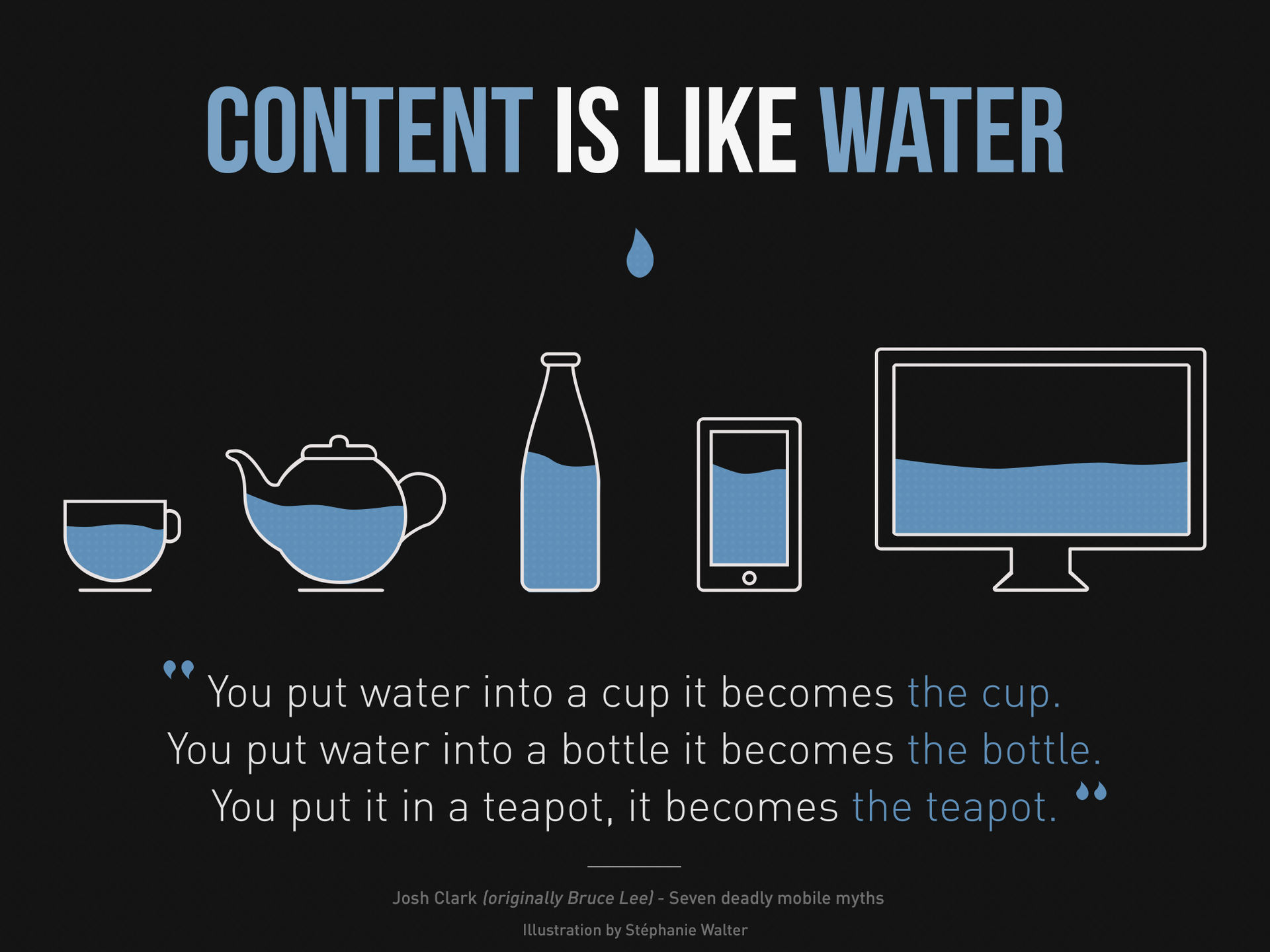
Notice that this line of code is actually simpler and shorter than the one above, yet has a more responsive effect. Responsive design doesn’t have to be difficult; it just requires you to think about the content on your websites more like water that takes the shape of its container, rather than something to be carved into stone.
The same principle can be used for other HTML elements as well. When you create responsive <div> sections (using fluid percentages instead of fixed pixels), for example, the sections of your webpage change size depending on the size of the viewer’s browser window. If those responsive <div> sections are filled with responsive content (like the responsive image shown above), then your whole website can easily shrink and grow depending on the size of the device it’s being viewed upon.
Awesome! We’re masters of responsive web design now, right? Well, not quite. What happens when your images and text get resized, on a smartphone for example, to a point where they’re too tiny to see at all? And how can we test the responsiveness of our websites if we don’t own every model of smartphone, tablet, and large screen on the market?
Join us over the next two weeks for simple and practical answers to these questions, in “Responsive Design 102: Bootstrap” and “Responsive Design 103: CSS Media Queries & Google Chrome Tools!”
